Hey testers! I’m Jacopo, a developer working on WordPress.com, and we’d like your feedback on a new feature — Comment Management.
What is it?

This is a new sidebar menu that allows you to manage all of your comments on WordPress.com.
Up until now, the notifications panel was the only place where you could manage comments on WordPress.com. In notifications, you can like, approve, trash, spam, and reply to comments. This will work for most people, but we also want to provide a dedicated comment management interface for advanced users.
For those of you who have used the WP Admin interface for managing comments — we are completely redesigning the interface on WordPress.com to make it easier to use.
I won’t explain the interface too much, because it should be easy to understand. If it’s not, we want to hear all the feedback you have if you run into any issues! Here are just a few benefits of the new interface:
- Easy to use on your phone.
- Condensed list makes it easy to read more comments at once.
- Quicker load times.
Future enhancements
You might notice that some features are missing. We are working hard to add some major enhancements in the near future! These are some of the features we are planning to add soon:
- Bulk edit.
- Quick actions in the comment list.
- An info panel that will show more user detail, like IP address.
- Comment editing.
- Comment searching.
- Block users with one click.
What to test?
- First and foremost, manage your comments! Make sure all of your routine actions behave as expected (like, approve, trash, spam, reply).
- Try undoing several actions.
- Switch sites if you have more than one.
- Try using a Jetpack site.
Write any feedback you have as a comment on this post, and thank you for testing!
We are going to gather feedback about this idea for five days, until Monday, August 14, 2017.

Hi! I will keep testing this over the next few days but here are my first thoughts/findings:
High-level (I’m a .com user). I love the location, the look and feel of it all.
Tested today on WordPress.com, PC:Chrome, Free Site
1) Batch editing is definitely needed (glad it is coming soon) – especially for quickly deleting spam. The first thing I wanted to do was to clear it out. 🙂
2) Issue found when testing moderation on Pending comments:
In PENDING:
If I choose, APPROVE, the comment closes but stays in Pending.
If I choose LIKE, the comment automatically approves and moves out of Pending.
The comment automatically is approved and stays open.
I then have to close it and it remains in PENDING.
If I click on the SAME comment in PENDING (saying approved and liked),
Then Unclick LIKE AND APPROVE for that comment.
Then click LIKE again, the comment is approved and moves out of PENDING.
I think it needs to close and move out of PENDING the first time.
3) My comment notifications came through like this via email
cmtestingweb.wordpress.com/2017/08/10/comment-notification-sample/
Only had about 30 minutes to look but will do more over the next few days and comment as I find things.
LikeLiked by 3 people
LOL.. Never mind on the #3… that was me being silly using my dummy post. All is good on the email notifications. 🙂
LikeLike
Hi Christine, thanks for the first feedback!
I totally understand you when you say that a comment should disappear immediately when its status changes, and it’s something I personally support.
Though, our early user research and testing showed that this way was less confusing.
I believe this is one of those things that’s hard to find a proper agreement, and we’ll just need to try it for a bit and see if it actually works or needs some tweaking.
Regarding the bug: yup, I could reproduce it.
As long as a comment toggles between “approved” and “pending”, it should always be visible in your current list.
I think I’ve seen the same bug once during the development, but I haven’t been able to reproduce it until your awesome indications!
I’m already at work on a fix, hopefully it’s easier than I’m picturing. 🙂
Thanks again!
LikeLiked by 2 people
Great. Happy to help. I understand on not everyone using it the same way. Always difficult.
I’m sure you will love this idea, but what if there was a high-level on-off switch for how comments are handled? Like, if you want them to clear the minute you do something, they move appropriately… Or, leave them where they are? I know that is probably a long term thing but it may satisfy most of both camps. Just a thought.
The future enhancements sound great. I’ll keep looking if you find any specifics you want me to look at, just let me know.
LikeLike
Where is it? Do we have to do something in order to see the “new” comments page? It is not listed under Media like in your screenshot above. Thanks.
LikeLike
Hi!
I forgot to mention that the feature is only available to users with the “moderate comments” capability, which by default is assigned to the Admin and Editor roles.
If by any chance you’re logged in with, say, an Author user, you wouldn’t see the menu item.
LikeLike
Yes, I’m the admin. Here is a screenshot of the old comment moderation page and the list under My Sites showing no Comment section.
LikeLike
As far as I can see you should be able to check out the Comments section on Horizon.
Could you try with the direct link?
https://horizon.wordpress.com/comments/
It should open the site selector, pick one and you’ll be in!
LikeLiked by 1 person
Yes, that worked, thank you. Will check it out.
LikeLiked by 1 person
I did a quick comparison of the old WP Admin [Comments] with the new WP [Comments] on my blog.
(1) Yes, the new [Comments] is more compact (33 pages vs 36 pages).
(2) The comment that headed the list was
http://mellowcurmudgeon.com/2017/08/09/semper-fi/comment-page-1/#comment-1408
and looked much better *initially* in the old [Comments], but I was glad I persevered. Subitems about this comment follow.
(2.1) The comment is my reply to Poet Rummager’s comment on my post. In the old [Comments], hovering makes a row of menu items appear but does nothing to unpack «In reply to Poet Rummager». I need to open a new browser tab if I want to see what I replied to.
(2.2) In the new [Comments], hovering changes the cursor to indicate that clicking will do something. What? It was a relief to find that clicking provided a nice display of the comment on the same page, w/o doing anything silly. The display starts with the 1st line of what I replied to, which has a good chance of being enough that I will not need another browser tab. Glad that I can still open a tab *if* I want to.
(3) Another nice thing about clicking on a display in the new [Comments] that it lets me see expanded displays of several comments, all on the same page. It might be nice to have a toggle button for eliding the comments that have *not* be expanded, so that the expanded ones can be seen with much less scrolling past others of no interest at the moment. A few words next to this button could also mention that clicking on a comment will expand it. I doubt that I am the only one who is wary of telling a web page to go do *whatever* action is assigned to clicking on something.
(4) Of course, I noticed that [Edit] is not yet in the menu provided by expanding a comment as displayed in the new [Comments]. Yes, that omission is serious.
LikeLiked by 2 people
Hi there, thanks for the feedback!
I know that this new design it might be jarring at first look, but the idea is to give moderators a super quick way of approving/spamming/trashing comments.
A “trained eye” can identify a spam comment just by looking at the username or at the first line of the comment, so they don’t really need all the info to be always visibile.
On the other hand, it must be clear that if you want to read the comments to a post, this is not the right place.
The Reader, or the post itself of course, are a much better experience for that.
We’re still pondering about the expand/collapse behaviour.
I personally feel that this is a good way to go, but it might very well change in the future. I’ll bring your point in the design discussion about it.
About the compactness: the pages difference might be caused by the fact that in this version we’re not currently showing Pings (pingbacks, etc.).
Pings, and the possibility of editing comments, and so many other features: they’re all currently in development.
I want to reassure you that all the features currently available in WP Admin (not only those mentioned in this post) will be eventually available here too – and definitely improved and simplified! 🙂
LikeLiked by 2 people
My comments were meant to be more favorable than they seem to have sounded.
I do like the more compact display of the new [Comments] tab, even for the Approved folder.
This morning there were 5 longish items in my Spam folder, and I was *delighted* to have the compact display for that folder. No scrolling B4 being ready to hit the [Empty Spam] button. (That button is not there yet in the new [Comments] tab, so I hit the button in old [Comments] tab.)
I agree with the concern in another tester’s comment about 1-click blacklisting of anything by so-and-so. Would like to see a popup asking me to confirm that I really want the specific action. Accidental clicking does happen.
LikeLiked by 1 person
I’ll take this as a compliment, so thank you very much! 🙂
I believe that we’ll follow our usual pattern: if the action is permanent (see for example the “Permanent Delete” action you can find in the Spam and Trash lists), you’ll get a confirmation popup; otherwise you’ll just be able to revert your action via the Undo button in the notification, or by toggling the “Block/Unblock” button.
LikeLiked by 1 person
I got to look at this a little more, tonight.
General Things/Thoughts
1) Was the color there for pending comments, yesterday? I don’t remember it but I like it! That helps know what I’ve reviewed!
2) I have my comment settings to anyone can post for testing. There is no validation on the email and website. Should there be? Meaning that I can type whatever I want and it doesn’t remotely look like a website or email address for those two fields.
3) The “Block Users with One Click” Future Enhancement: I like this thought, assuming the comment is already in spam, but I would hate for the one click to be too easy to mistakenly click.
Using the app on my phone (iPhone 5s):
I never use the app, so not sure if the comment feature is new there or not, but took a look anyway.
1) I cannot figure out how to view Trash or Spam. If I mistakenly mark something as Trash, I see it on my desktop but can’t find them in the app.
2) I have the ability to edit comments on the app, but when I do, it shows the html tags until it refreshes. Screenshot of my phone: https://cmtestingweb.files.wordpress.com/2017/08/commentsonappwithhtmltags.jpg
I did note that once I viewed the same edited comment in the desktop Customizer, that the html tags disappeared.
Personal Note: High-level, I like where it is going.
LikeLiked by 1 person
It’s great to hear you’re liking it! 🙂
1) The pending color’s always been there; same for the little “Pending” label when the comment is expanded.
2) This tool is meant for moderators, not normal users. By default, only Administrators and Editors can see and use it.
So, if you got there, the system already knows who you are and that you’re allowed to do whatever you want, and there’s no need to ask you for more info.
3) We’ve yet to start working on this so take my words with a pinch of salt, but if there is a “one click block user”, I’m pretty sure there’ll be a “one click unblock user” as well! 🙂
About the app: I’m sorry if my post was confusing. This call for testing is only referring to the browser version of Comment Management.
The mobile app is handled by other teams, and I don’t know enough about their work to help you with that.
I can pass your findings along to them, though!
LikeLike
Okay… so “Easy to use on your phone.” Is that on a browser on your phone? Or just disregard? I was making sure I covered everything you listed. 🙂
Oh, and #2 with the email/website is when I actually comment on a blog I can type jiberrish that doesn’t represent either one of those in the fields and it will take anything. I realize that isn’t necessarily your area as it is the user interface on the blog. I think I was just surprised that it took whatever – I never tried that before. 🙂
#3 – 🙂 Makes sense.
Great. Looks like a great start. I’ll stop looking unless you need anything new tested.
I hope you have a great weekend!
LikeLike
Yup, when we talk about the phone we actually mean on the phone browser.
About email/website: now I get it. But you’re right, it’s not my area of expertise. 🙂
Though, if I’m not mistaken, those fields are not there for security reasons, so yes people can enter anything, and we’d be good with that.
Thanks for all the feedbacks and have a great weekend you too!
LikeLiked by 1 person
Okay, I tested on my phone with the browser (chrome), Looks good.
First and foremost, manage your comments! Make sure all of your routine actions behave as expected (like, approve, trash, spam, reply).
Try undoing several actions.
I tested Like, Approve, Spam, Trash undoing all actions with the quick undo as well as the not-so-quick undo. 🙂 All worked as expected.
Replies worked as expected and were super easy.
Switch sites if you have more than one.
Done. Worked fine. The issue I had was not with the comment section it is that I can’t switch sites and stay in the same window – but that is why I don’t use mobile – too small. 😉
Try using a Jetpack site.
Can’t help you there. Just use WordPress.com. 🙂 I’m assuming you mean a .org site here.
Best Regards.
LikeLiked by 1 person
Thanks again for the tests! You’ve been very thorough!
Yup: when we talk about Jetpack sites we usually mean .org sites connected to .com via Jetpack. 🙂
LikeLike
I’ve tested with Ubuntu 16.04.3 & Firefox 54.0
Everything (like, approve, trash, spam, reply) worked fine.
Undoing (like, approve, trash, spam) worked fine in all cases.
Switching sites worked fine. ‘Comment Management’ stayed active after the switch and displayed the updated comment list or a warning for missing permissions.
Couldn’t test, as I haven’t got one.
Now to the things I noticed.
Starting view
As discussions/comments unfortunately tend to spread out across different platforms (Twitter/Facebook/…), I wanted commenting to be as easy as possible on my blog. That’s why viewers/readers on my blog aren’t required to fill out the name and email field or have to be registered (see Discussion settings). This means, I occasionally get anonymous comments.
As a result of this I usually don’t have any ‘pending comments’. Comment Management’ starting with the ‘Pending’ view therefore is not much of a help. Don’t know if this would be possible but could ‘Comment Management’ check if there are any ‘pending comments’ and in case there aren’t go straight to the ‘Approved’ ones? Would save me one click 🙂
Anonymous username
As I said, I occasionally get anonymous comments. When a viewer/reader leaves the username field blank, WordPress automatically adds an ‘Anonymous‘ username. The notification panel adds a ‘Someone‘ username.
‘Comment Management’ on the other hand doesn’t add anything at all. (→ Screenshot). How about adding one or the other to stay consistent?
Site Icon & Gravatar
Not sure if this has got something to do with ‘Comment Management’.
When I click on a post URL in the ‘Comment Management’ screen, the post opens in Calypso, which displays my site icon and the gravatar on top of each other. Is this a bug or intended? Frankly looks wrong in my eyes. (→ Screenshot)
Future enhancements
Is this really just an info panel or would we possibly be able to automatically add some of the displayed data like username, IP address or email address to the comment blacklist? Maybe by button?
Cheers
Martin K.
LikeLiked by 2 people
Hi Martin! Thanks for the feedback!
You know I recall this being in discussion a while ago, and we might have lost track of it during the development?
It’s true that this tool is mostly for moderation purposes, but as a normal user myself with sites with open comments, I found starting on Pending a bit odd a times.
I’ll bring your point over to the design discussions and see what we can do about it. 🙂
I have to admit: we totally missed this case. I’ll see to fix this as soon as possible. Thanks!
You’re right, this has nothing to do with Comment Management.

Your screenshot looks weird because you have the same image for both your site icon and your Gravatar – and it’s also almost circular with a white background, which makes it look even weirder!
See for example how it looks on one of my test sites:
I think this is basically what the one click “Block User” button will do.
I say “I think” because we’re yet to start working on it, and I’m not sure of the approach we’ll use.
LikeLike
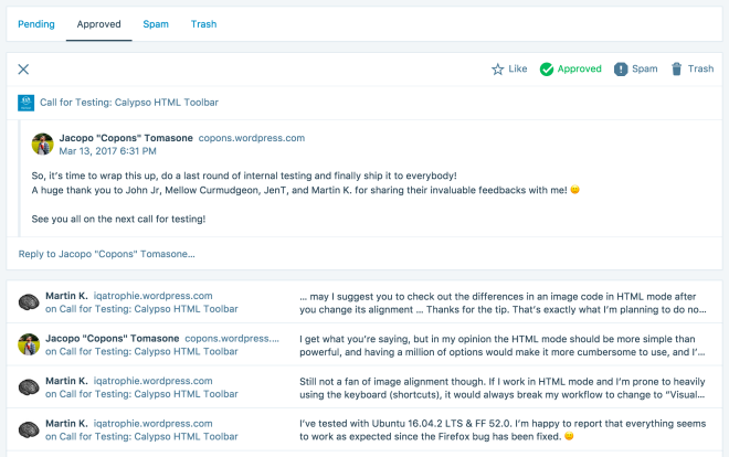
Time to wrap this up, as I’m shipping this to everybody as we speak!
A huge thank you to Christine, dandelionsalad, Mellow Curmudgeon, and Martin K. for sharing their invaluable feedbacks with me! 🙂
See you all on the next call for testing!
LikeLiked by 2 people